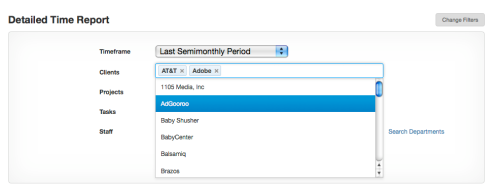
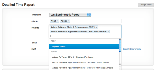
Harvest, the time tracking and invoicing tool we use, just added a new filter mechanism to their report generator. While I appreciate the additional functionality, I was most impressed with their multi-select combobox. It looks like a normal text field, but once the field has focus you can select any option and it will be added into the field, click again and you can select another option, building up any number of options. The field just gets larger (more rows are added) when you add more options than can be displayed in a single row.
It is equally easy to remove items from the field by clicking the little ‘x’ next to each option.
Does anyone know if there is a JQuery control for this? That would be awesome. A Flex control like this would be nice too, just in case there are any motivated developers reading this (wink, wink)…
Update: Rajesh Rajappan provided a link to the JQuery control: http://loopj.com/jquery-tokeninput/. It has autocomplete with multi selection.
Update again: Harvest released this control called “Chosen’, it is available here: http://harvesthq.github.com/chosen/


You could try to customize jquery tag-it plugin.
You could also try http://loopj.com/jquery-tokeninput/.
Its an autocomplete with multi selection.
That’s it- perfect!!
Kinda similar interaction concept, although it is looking quite different
jQuery UI Multiselect
http://quasipartikel.at/multiselect/
Thanks for sharing the link. Yep, this will do the same thing, but I think the other one will a) take up less space
b) be easier to use.
A little bit different, but I like that the jQuery tagedit plugin allows for editing existing tag entries.
A very interesting interaction indeed! I was wondering what was your take on the following two aspects of this UI design:
– Discoverability – It is great once discovered, but it not obvious upfront that this option is available. Although I do think that discovering is not too difficult either, but I would like to know your take at how you would have evaluated this in a design meeting!
– The addition of long filters adds to the vertical height of the form. Is that something of a concern at all?
I think this control has an excellent change of being discovered since the options display as soon as the field has focus. I guess we would have to test it to determine if an additional indicator should be provided (maybe a watermark?).
For the length of the form- this sure beats a couple of dozen checkboxes on the screen :o)
Now that you have mentioned it, I can picture the plethora of check boxes on the page – so yes, this indeed is more space efficient than the obvious alternative!
Theresa I’d be very curious what you consider the ‘standard’ keyboard control for this widget. I implemented something similar recently using an older jQuery plugin (http://code.drewwilson.com/entry/autosuggest-jquery-plugin) and was doing some major customization to refine the keyboard controls.
The expected behavior was really unpredictable user to user, and we almost went to the point of adding instructional text.
Specifically I’m curious what key(s) you would choose to confirm a choice, and as to what happens next (does the dropdown stay open? do you move onto the next field? etc)
Harvest has open sourced their jquery plugin recently:
http://www.getharvest.com/blog/2011/07/chosen-plug-in/
ps: I found this post on the “Designing Web Interfaces” blog first and it’s not possible to comment on the post there.
That’s great, thanks for providing this link