Archives For January 31, 2008

After getting lots of great feedback on my Seek or Show Design Paradigms entry, I though I would elaborate a bit on each starting with Seek (Search).
Ajax, Flex and Laszlo have provided us with away to replace the effort intensive, page based search with a simple, more responsive user interface. Why should we move away from the traditional search design? Because it is inefficient, cumbersome, and designed around technical constraints that no longer apply.

Traditional Search
Requires lots of effort to find, refine, and explore the results. Searching starts with a keyword or multiple criteria and many pages of results are returned. The user must then refine the result set. Lots of back and forth ensues, while navigating from the ‘search results page’ to the ‘detail page’ and back again.
Rich Search
Requires minimal effort to seek, refine and explore results. Refine options are integrated in the results screen. The results are dynamically refined when selections are made- no page refreshes. Multiple levels of details are readily available.

The Principles of a Rich Search

The user experience should include:

  • Multiple view options
  • Scrollable results (versus paging of results)
  • Integrated refine feature
  • Progressive disclosure of details
  • Save functionality available (search, results or both)
  • Ability to change initial Search terms without leaving the screen

The Principles in Practice
I’ve taken the best interaction design from three RIAs: AlexSystems Kids Store, Roost, and eBay’s Playground, and redesigned a major car sales website to demonstrate an ultra rich search experience.

RIA 1: AlexSystems Kids Store
AlexSystems created this prototype for the Laszlo showcase. They collapsed the traditional page based search into a single interface. The number of results are clearly displayed across the top, refine options down the left, with an integrated shopping cart below. Three levels of detail are available for each item.

Hover Details
Hovering over an item displays the item’s name and price. This is ideal for displaying results that are judged initially by appearance (homes, cars, dates) because it keeps the screen from being crammed with text.
first.png
Birds Eye View
Clicking on an item opens a layer with name, description, price, and common actions:[detail] and [add].The Birds Eye View requires less commitment from a visitor than asking them to navigate to another page just to see a short product summary.
second.png
Full Description
Accessible from the Birds Eye View, expands to show a full description of the item, and the options to [add] and navigation [back to the search results]. A nice addition to this would be next and previous buttons to jump directly to the other items in the results.
third.png

RIA 2: Roost
Roost is great example of a rich search experience. They have a very tight design that meets most of the requirements for providing an easy way to seek out information, refine the results, and save searches to make it easier for future use.

Refine Your Search
Clear terminology and simple options make it easy to refine the search results. The most commonly used options are shown by default, while the less frequently used options are collapsed. Results are refined dynamically (no extra button to click)
roostrefinecrop.png
Reset Filters
This is one of the simplest ways I’ve seen for clearing filters. They used a custom component so it would visually stand out from other form components. The Reset option is available above and below the refine panel, making it hard to miss when it’s needed.
reset.png
Saved Searches
The Save option is in proximity to the Search box- so it is easy to find. Saved Searches are shown directly below- and have a quick remove feature, so it is simple to manage the list.
roostsave2.png

RIA 3: eBay’s Playground
eBay is looking to provide a better user experience by integrating some rich components. The Playground is still very page oriented, relaying heavily on breadcrumbs, and page reloads for refining results, but they have introduced some useful features.

Multiple Views
eBay’s Playground offers results as a List View, Picture Gallery or Snapshot. I think Picture and Snapshot will probably end up combined, but it is nice to have a more photo-focused option for scanning results.
eBay Snapshot
Hover Details
Hovering over a photo in the Snapshot view provides the next level of details about an item. This is an decent design, but basically provides the same information as the List, yet it requires more effort on the visitors part to mouse over each item for the information. They could significantly improve this experience by integrating the full photo gallery in this layer.
eBay Snapshot Hover
Narrow Your Search
Common categories and sub categories are shown on the left, with the number of items in each. eBay users are accustomed to this method for filtering the results- and navigating deeper into eBay’s vast category hierarchy. Unfortunately, the filters aren’t dynamic, making it additional work to scroll down and find the silly ‘Go’ button.
eBay Narrow Search

The Ultra Rich Search Example
I decided to rework the CarMax search experience as an example. I’ve incorporated the principles to present a generic solution. A real redesign would need to involve allot more information than I have on hand at this time. Also assume there is a free form search on the CarMax home page that precedes these screens.

CarMax Search Results

Results Screen
Shows all the results matching ‘mini cooper’. Left side allows for refining the results based on more criteria. The middle displays all the results, large photos making it easier to visually scan. There is a List View option as well as the default Photo Gallery view. Results are sorted by default. Right side acts as a workspace for Saved Searches and Saved Vehicles.

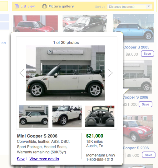
CarMax Click Details

Click Details
Clicking on the photo opens a layer with more details about the vehicle, including the full set of vehicle photos, seller info, and the options to ‘Save’ and ‘View more details’.

CarMax Refine and Save

Refine and Save Features
Adjusting controls on the left dynamically refines the results (no silly ‘Go’ or ‘Search within these results’ button needed). Saved Searches and Saved Vehicles are visually chronicled down the right side of the screen. Saved Vehicles can then be compared.
References

(1) Alex Systems LLC (2005) http://www.alexsystems.com/